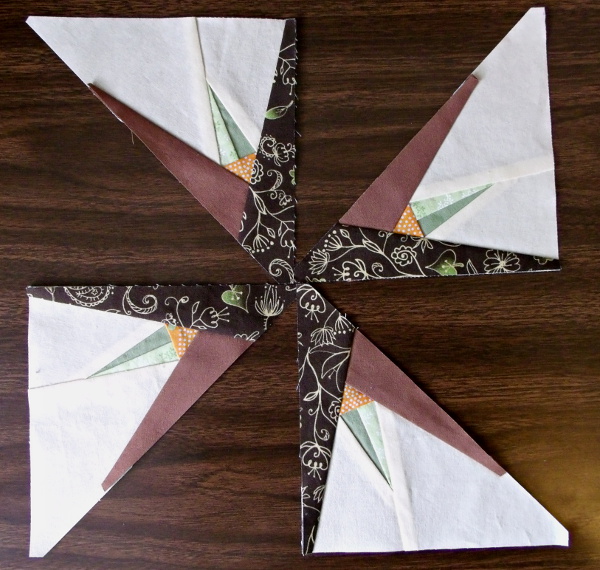
I got over being scared of the surveyor’s compass block and picked out fabric for it. I dithered for quite a while about the little triangle of contrast color. Most of the examples I saw used a complementary color for contrast, but what’s the complementary color of brown? Nothing flashes with brown. I figured based on the smaller green points, something purplish or red would work since that’s opposite green/light green on the color wheel. But I thought red might look oddly Christmas-y, and the only purple I have on hand is a sort of muddy brownish purple that just blended in with the brown.
But I have some bright orange, so orange it is.
Now that it’s finally warming up outside, my plan is to start taking photos outside so they won’t be so dingy-looking. It’s really windy out there today, though, and these were threatening to blow away, so I came back inside. I just finished the first four segments of the block:
Now back to cutting out a bunch of cardstock hexagons. I decided to make a mug rug to get some much-needed practice with binding before it comes time to bind the entire quilt, and I’d been making some sketches playing around with a design made out of half-square triangles. But this morning I changed my mind and decided it definitely needed to be hexagons.

